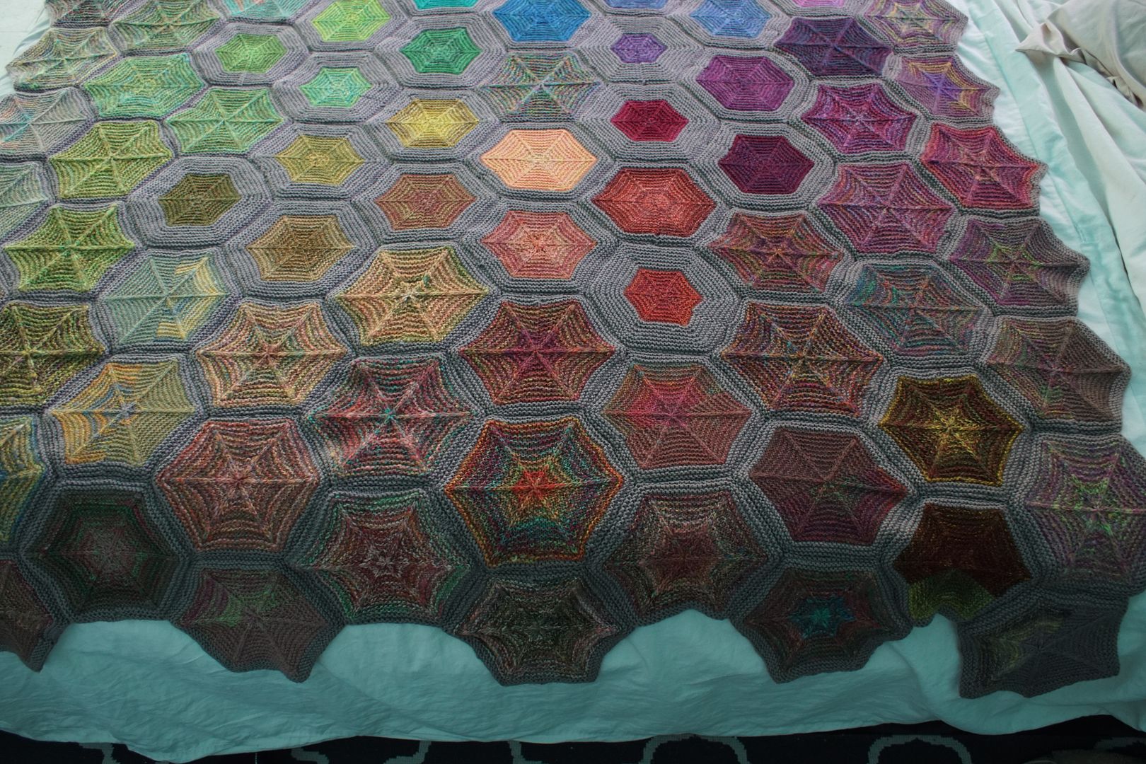
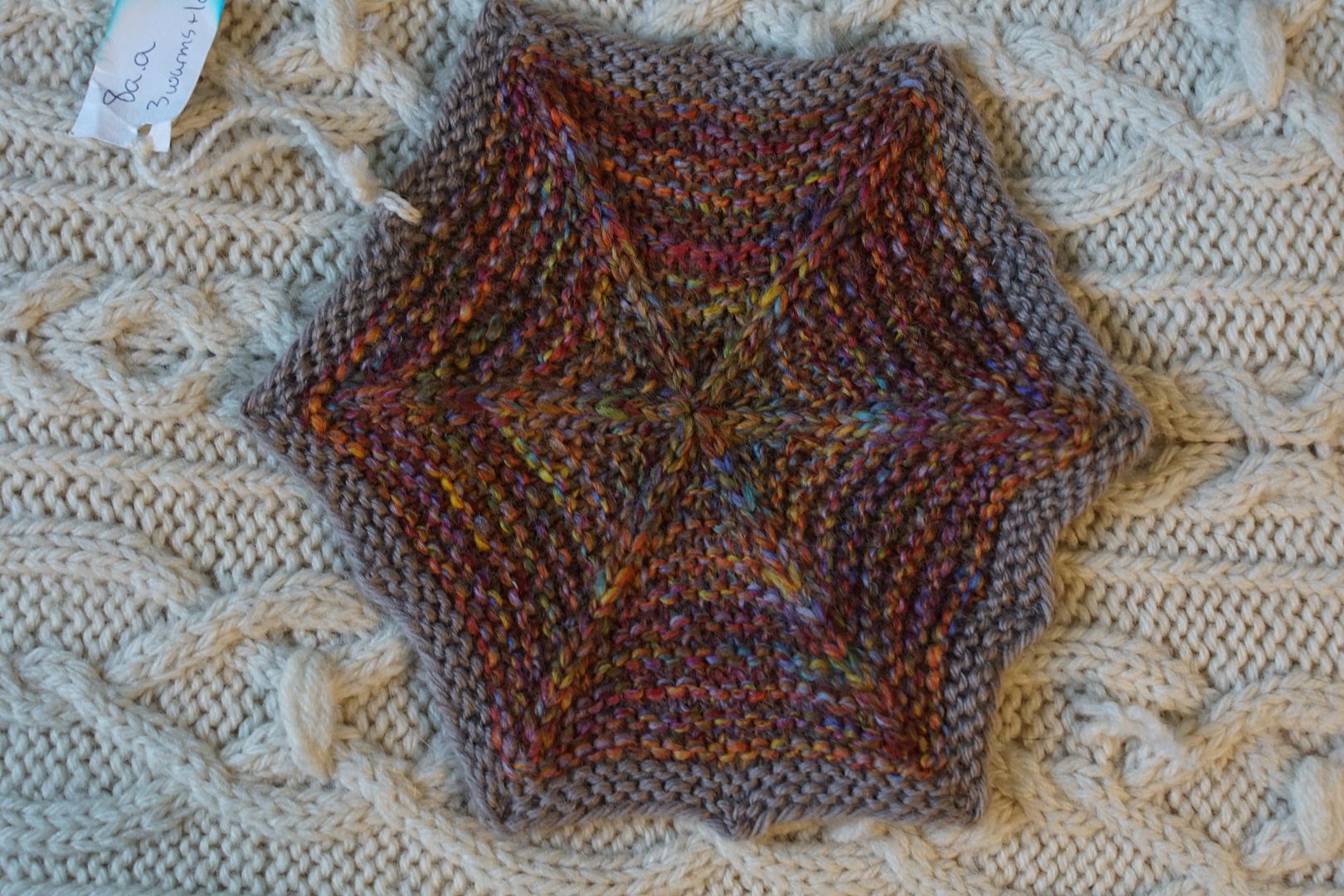
Let's crack on, shall we? https://hosting.photobucket.com/images/i/osbornfiber/DSC06717_cob26nKPBAp79rgoSRnP4g.JPG In the first corner, these are colours dominated by red. I've mapped them out below. The hexies in this area without numbers are f…
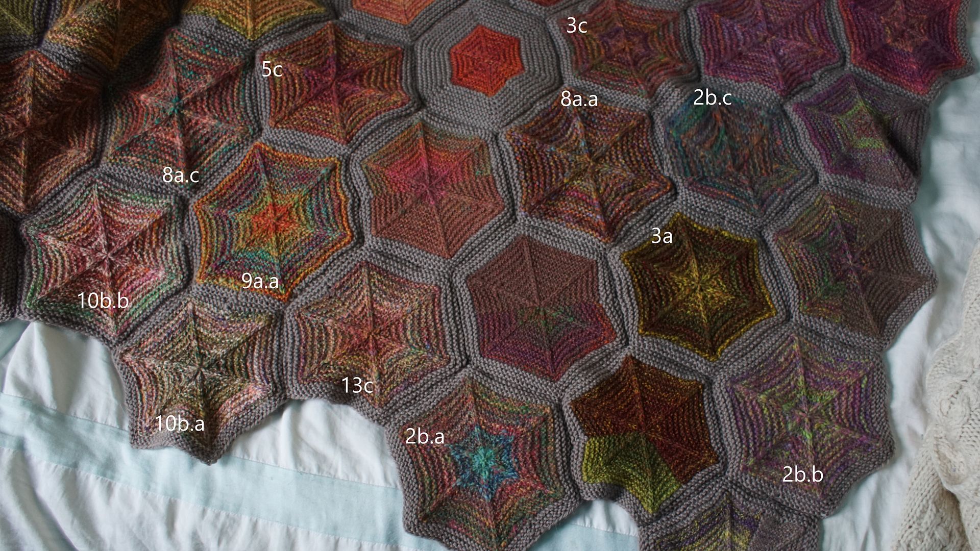
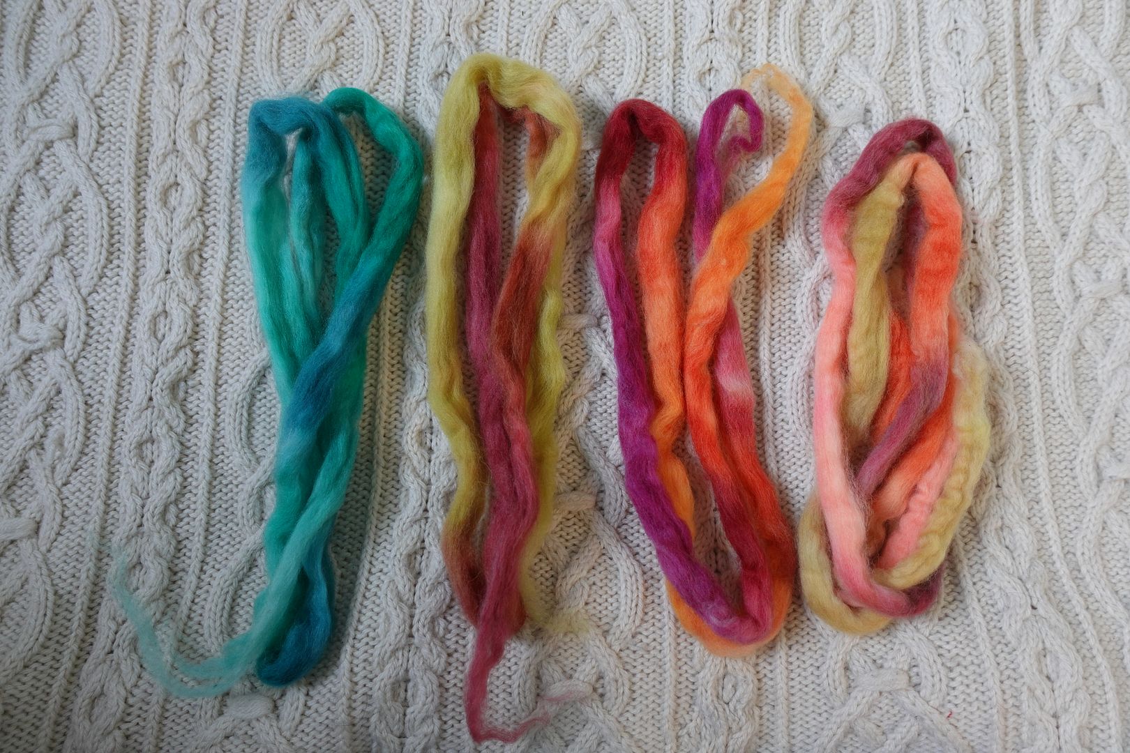
In the first corner, these are colours dominated by red. I've mapped them out below. The hexies in this area without numbers are from samples spun from a single handdyed colourway. You can find them in this post.
Below, I've ordered them by the most saturated, or most generally red-looking, to the least saturated. As you look through them, which ones stand out to you? Which combinations surprised you? Tell me which one is your favourite, but also tell me - why?
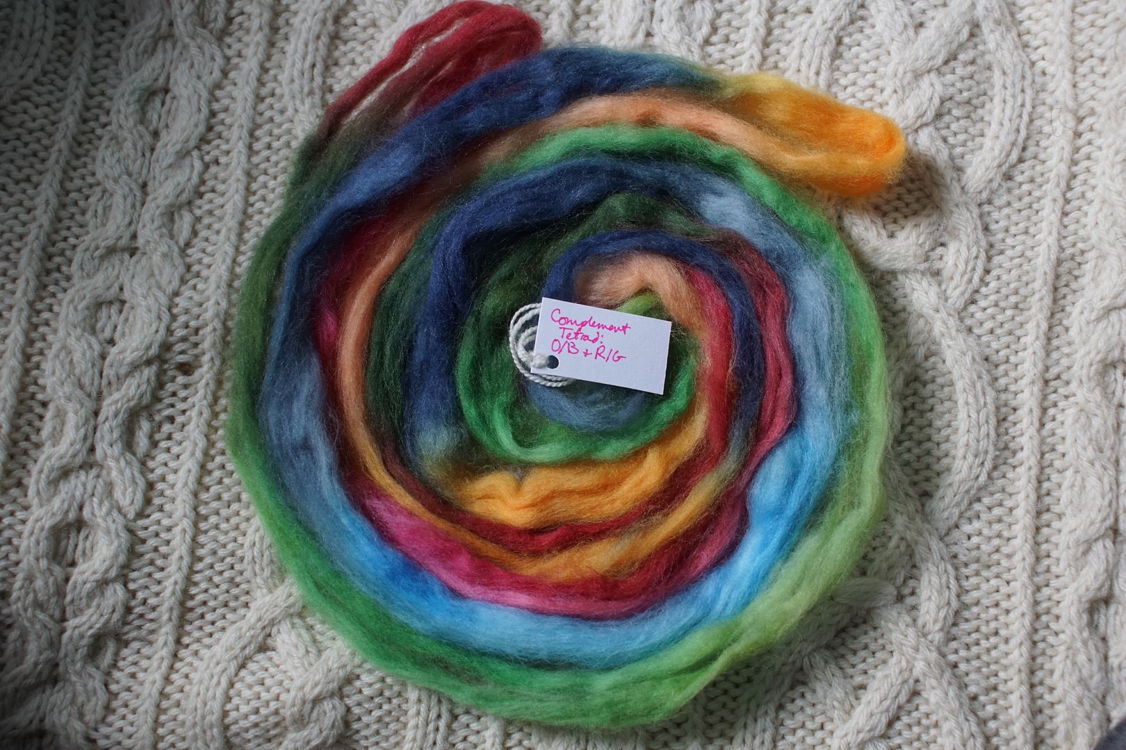
Contrast of hue: High Contrast of value: Low middle minor Cold-Warm Contrast: Warms take over, cool is in pops Complementary Contrast: Present Simultaneous Contrast: Evident in the light teal shifting blue, perhaps paired with the pops of red-orange shifting orange. Contrast of Saturation: Lots of desaturated red, saturated green and orange is in small amounts Contrast of Proportion: terra cotta allies w orange to make high percentage and take over
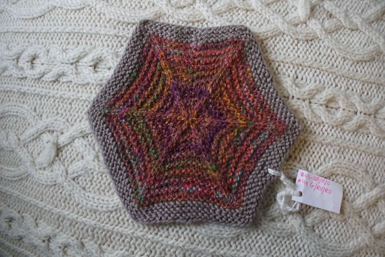
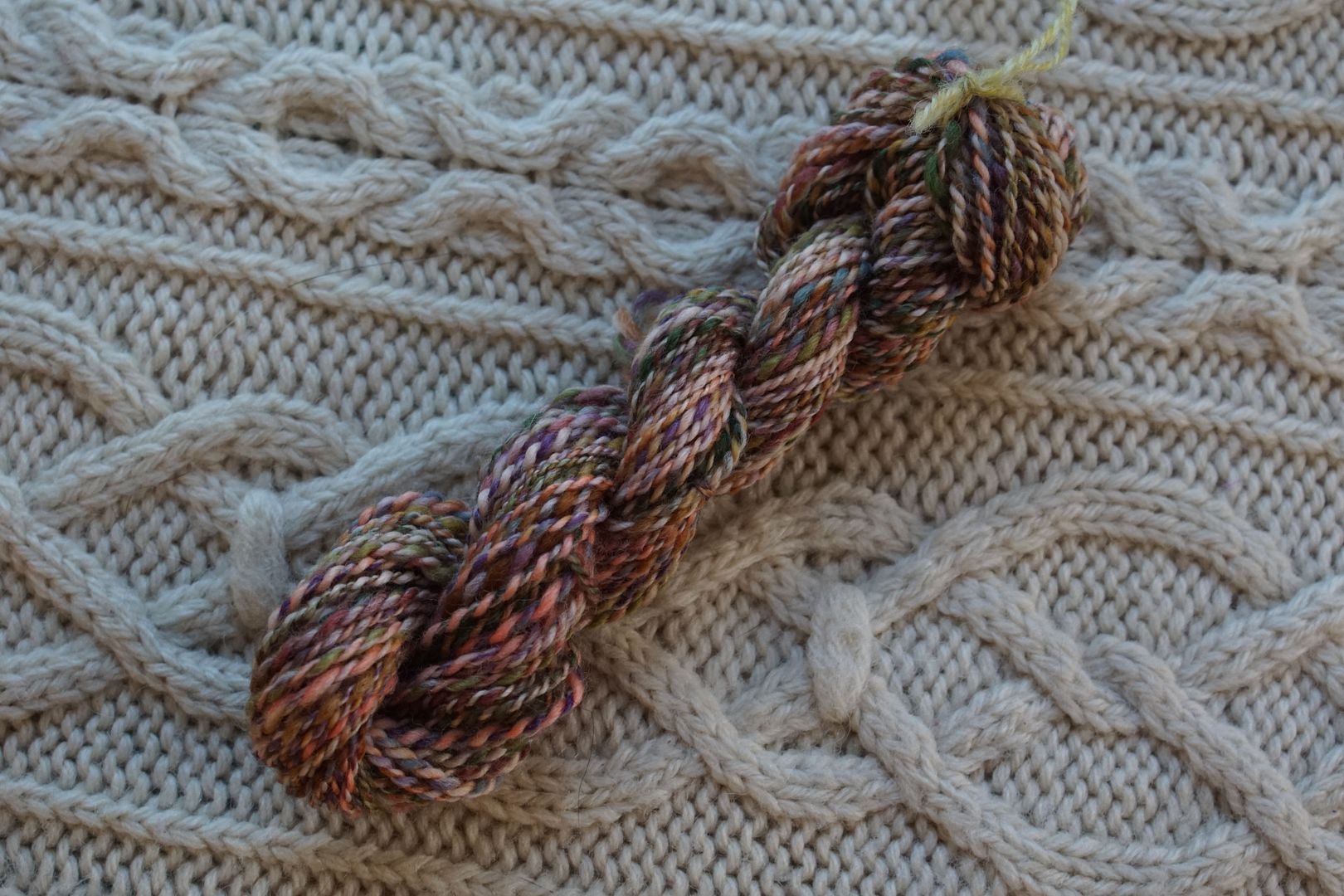
There's a colour name I bat around a lot in my head in this section of the blanket: terra cotta. For some reason that dull, dark red came through in a lot of my dyeing. It has this tendency to grab the surround colours and swallow them. It's not a colour I love, and I'm quite suspicious of it! It forms the background of several of these hexies.
Contrast of hue: High Contrast of value: Low middle minor Cold-Warm Contrast: Common hue terra cotta is warm, only real cools are green and violet Complementary Contrast: Present Simultaneous Contrast: Evident, green made to look cool and pop, but quite blended Contrast of Saturation: Everything middling desaturated except red-orange Contrast of Proportion: Reds and oranges unite and take over, well blended so others are complex and subtle
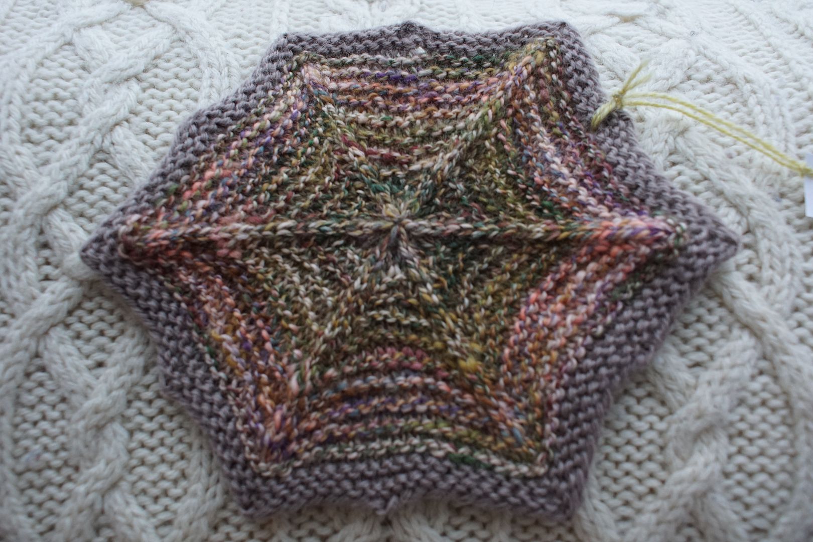
The terra cotta and purple are not my favorite companions. I like it with that golden yellow, and just a touch of green. Of course, it's just bad luck that in this and the previous hexie, the purple all ended up in one section of the yarn, which happened to be central in the hexie. I like the better-blended yarns more, as you will shortly see.
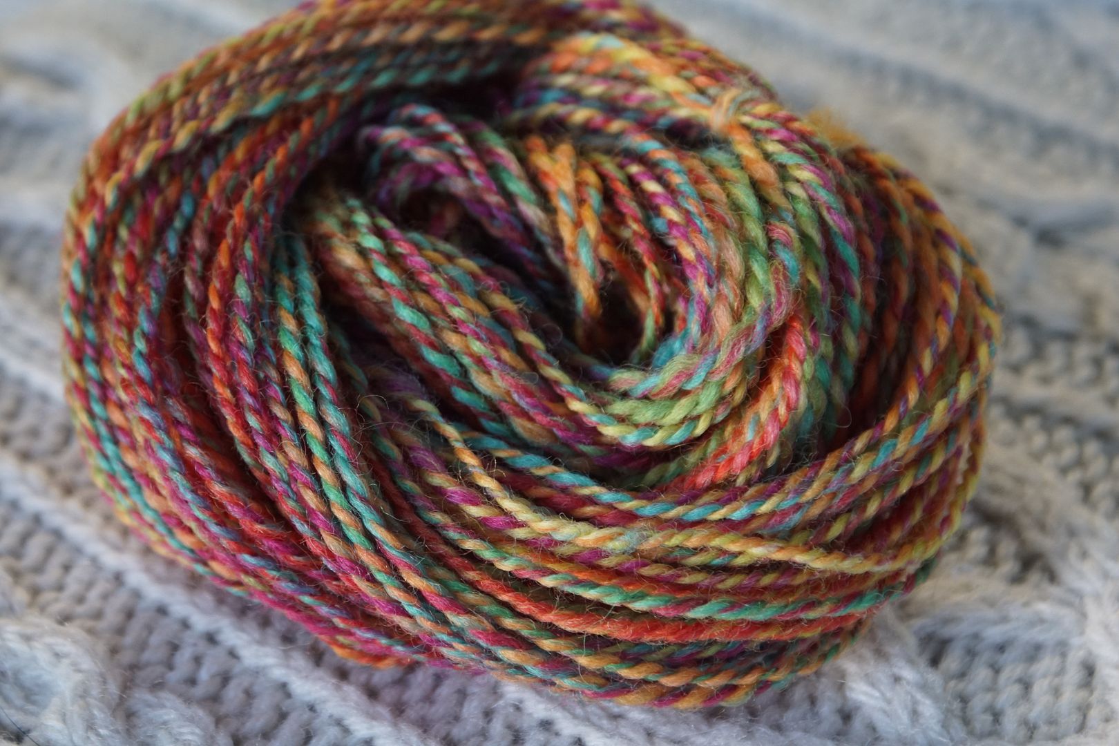
Contrast of hue: High Contrast of value: Middle minor-ish Cold-Warm Contrast: Dominated by warms, but cool is very cool, and warms very different to each other Complementary Contrast: Present Simultaneous Contrast: Not evident – blue pops but does not shift, green does not pop Contrast of Saturation: Warms more saturated overall but varied, cools less saturated Contrast of Proportion: Are warms "stronger" than cools? Red slightly dominates, supported by browns, oranges, pinks; dull green disappears, blue pops
This one is so interesting because it looks like such a balanced mix to me. I accidentally spun it on the thicker side, but it still blended very well with how I prepped it on the blending board. It's so deliciously complex and hard to pin down, and the flecks of blue throughout are like jewels, rather than seeming out of place.
Contrast of hue: High Contrast of value: Middle major-ish Cold-Warm Contrast: Warms all very warm, cool very cool, not subtle Complementary Contrast: Present (tertiary: B-G/R-O) Simultaneous Contrast: Not sure – Doesn't really shift, but turquoise does pop. Contrast of Saturation: Dominant warms are 1/3 saturated, cools all saturated, makes for a good argument Contrast of Proportion: Warmth dominates, but all stays more saturated than some
This was in the same batch as the previous thickly-spun, well-blended yarn. Again here, the complementary cool "pop" is a really just one hue, and I think simultaneous contrast makes it stand out even more. It reminds me of distant memories of Albuquerque - demonstrating how powerful associations are in our interpretation of colour.
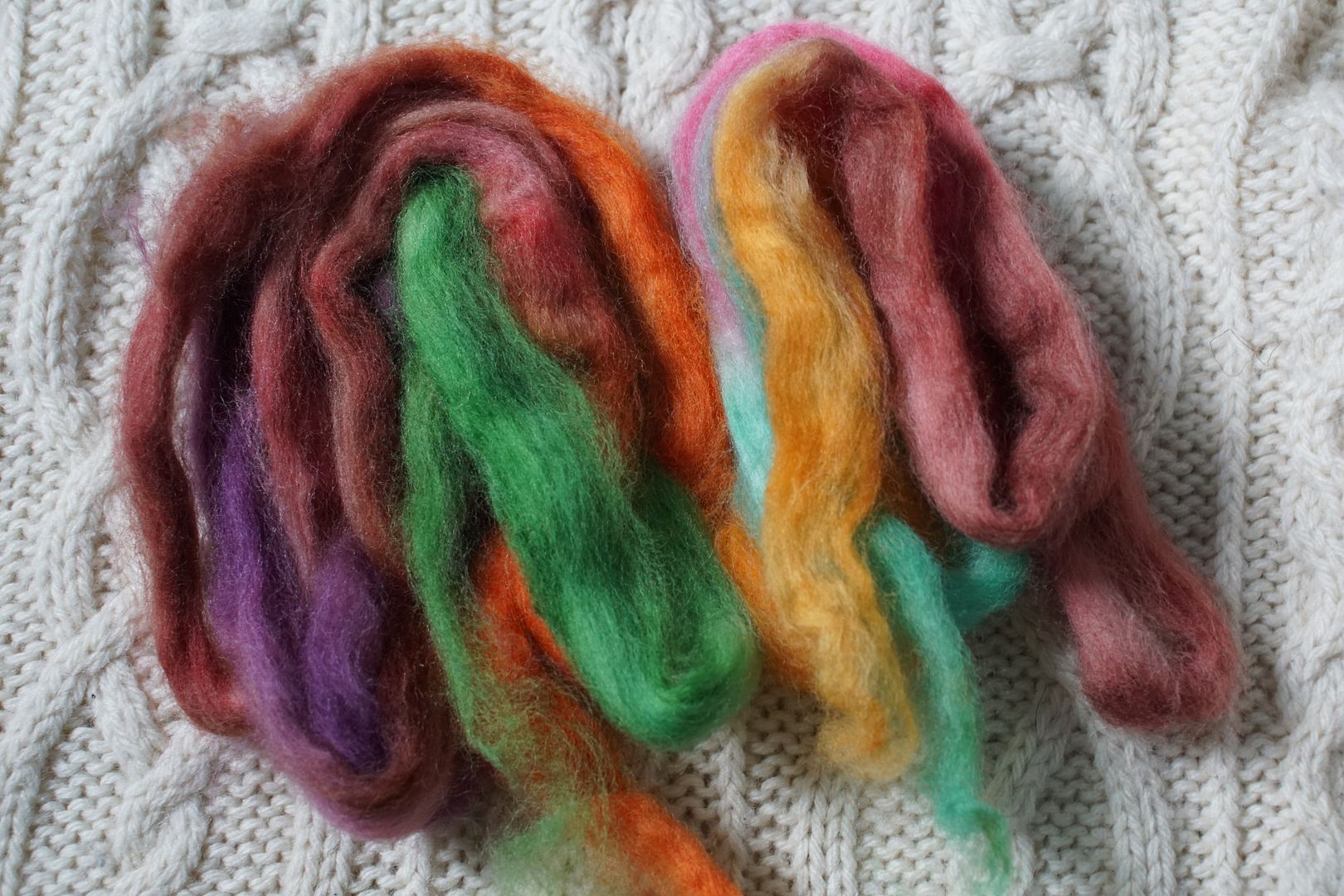
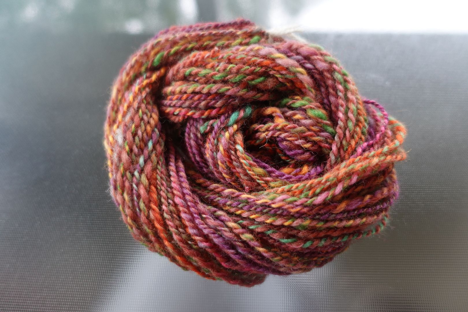
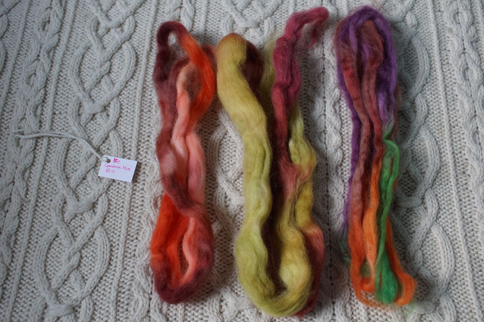
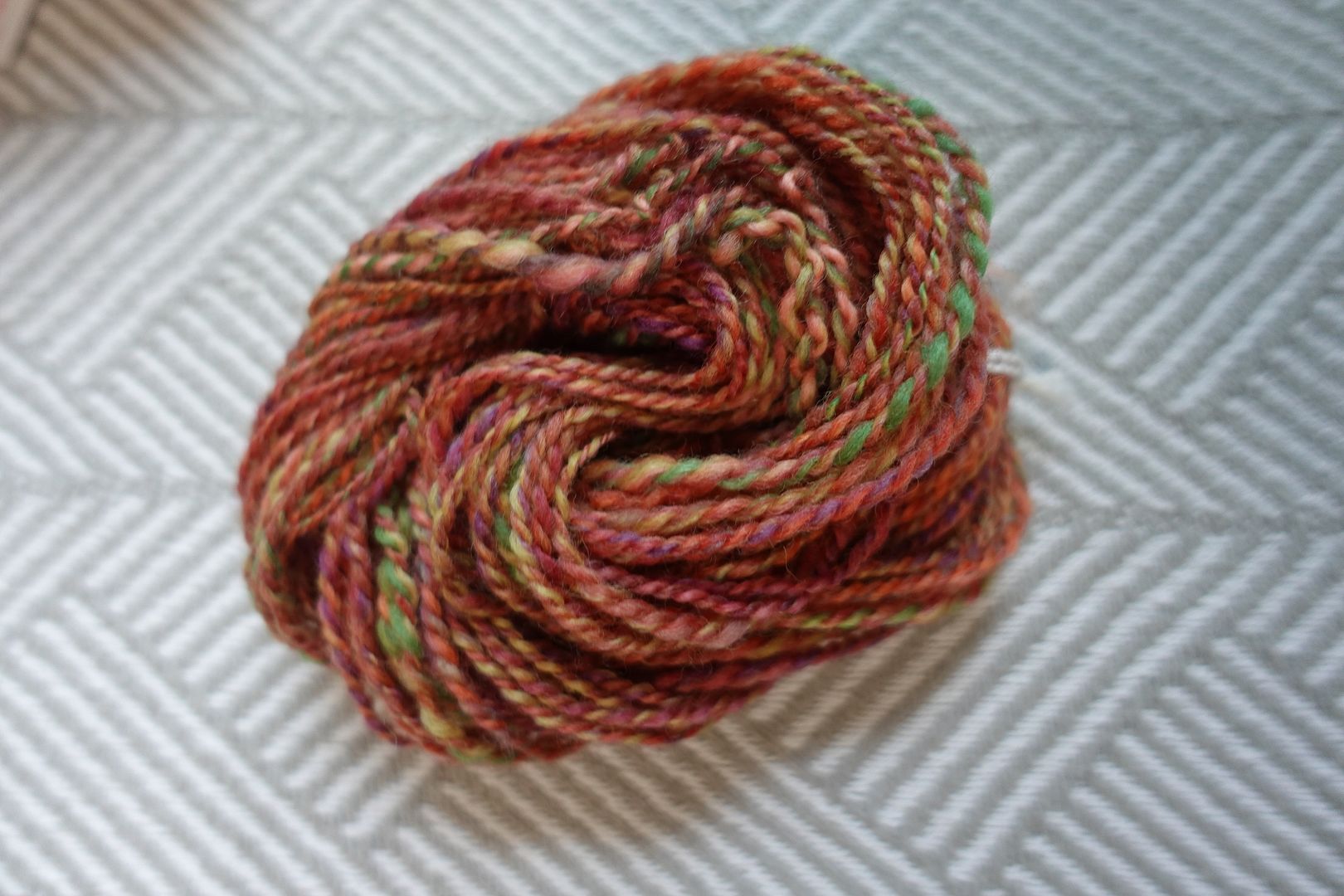
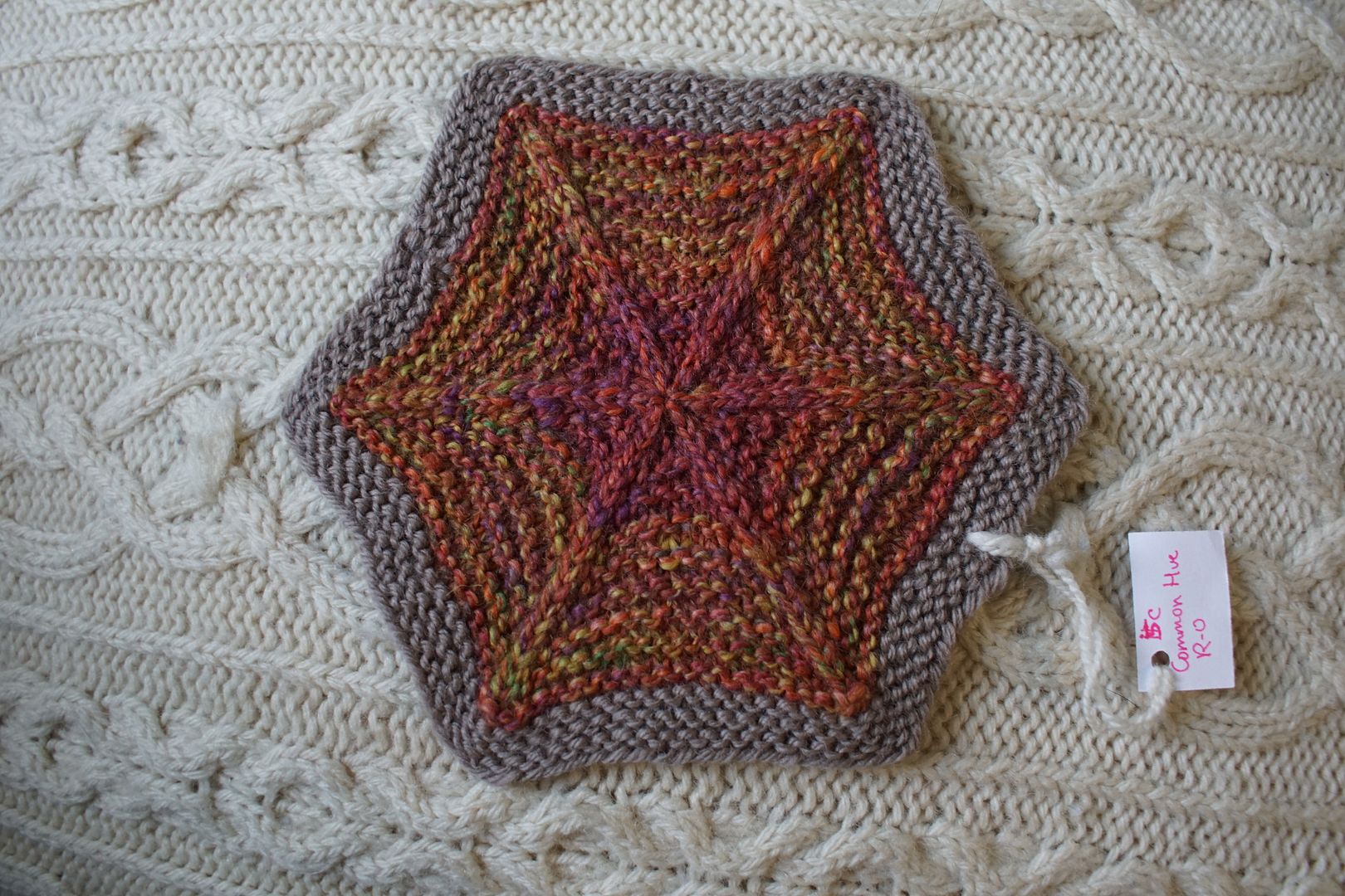
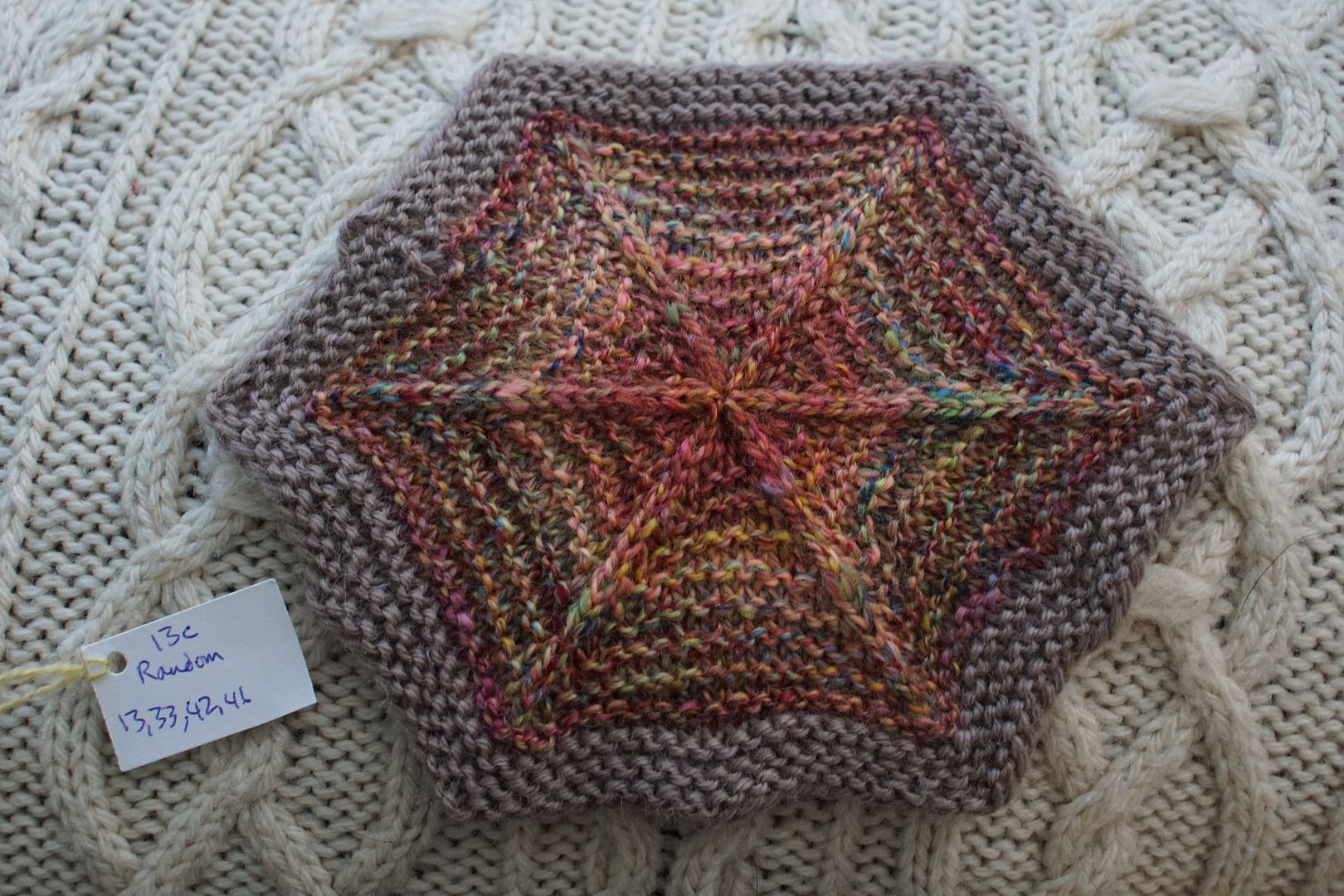
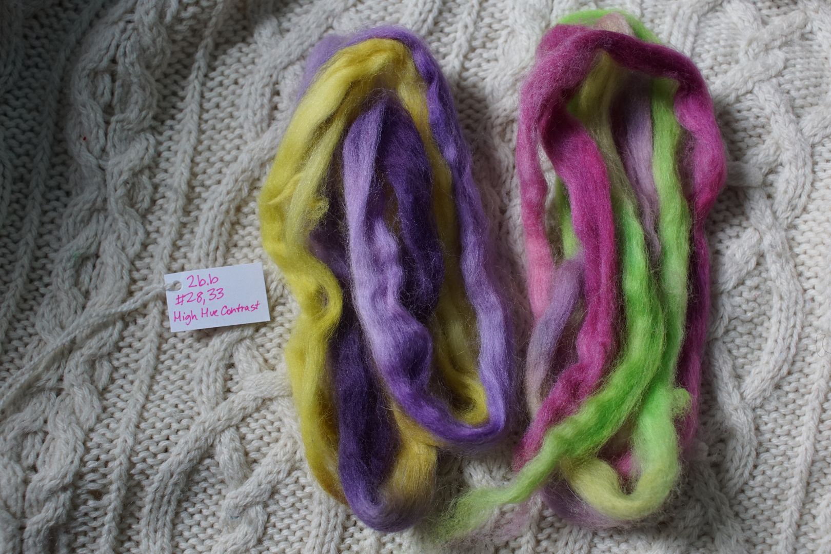
Exercise #: 13c Exercise name: Random Strip 1: 13 - Analogous Pale Yellow to Red-Orange Strip 2: 33 - Complement Red-Violet/Yellow-Green Strip 3: 42 - Split Complement Blue/Yellow-Orange,Red-Orange Strip 4: 46 - Triad:Primaries Prep method: Stripped and held together Spinning tool: EEW6 Wool breed: Cor1+Pol3
Contrast of hue: High Contrast of value: Cold-Warm Contrast: More warms, just a bit of blues and greens and cooler reds Complementary Contrast: Present Simultaneous Contrast: Not obviously evident to me, except perhaps in flecks of blue-green Contrast of Saturation: Mix of everything, pale, dull, intense, dark Contrast of Proportion: Surprisingly the pale oranges and the dull and dark reds blended to a varied terra-cotta background, with all the cools adding beautiful complexity.
For some reason, I thought this colourway would come out much brighter than it did. that terra cotta is there again, consuming everything in its path. This time it doesn't bother me as much, though. The pops of other colours are spread throughout, and the grey-blue in particular seems to ground it.
Contrast of hue: Extreme Contrast of value: Middle minor (well-blended) Cold-Warm Contrast: Lots of cool blues, quarter oranges, cool reds Complementary Contrast: Present Simultaneous Contrast: Evident in pops of teal and pink shifted red Contrast of Saturation: Oranges very saturated, everything else less so Contrast of Proportion: Cools took over, well-blended making plenty of mud
Making mud is hard to do, as we learned this year. But here I kinda managed it, by the way I blended the colours, and by virtue of the values being similar. If you want to blend colours into mud, having the values close together is a great way to do it, though it doesn't always work of course (see yesterday's post and 4b, which stayed speckly and bright).
Contrast of hue: Extreme Contrast of value: Middle Major Cold-Warm Contrast: Extreme, mixed, irrelevant Complementary Contrast: Present Simultaneous Contrast: Not evident; complements muddied Contrast of Saturation: Fairly even in fiber Contrast of Proportion: Very even. Extreme Hue contrast + low value contrast = mud
Same concept, but here similar colours lined up in plying, which prevented too much mud and mixing from happening. This was something that could have been prevented in prep, but it was one of my first ones!
Contrast of hue: High Contrast of value: Low major Cold-Warm Contrast: Warms and warm undertones Complementary Contrast: Present Simultaneous Contrast: Evident (red and green) Contrast of Saturation: All quite saturated except brown Contrast of Proportion: Maybe ¼ yellow very loud, 1/3 brown takes a muddy back seat
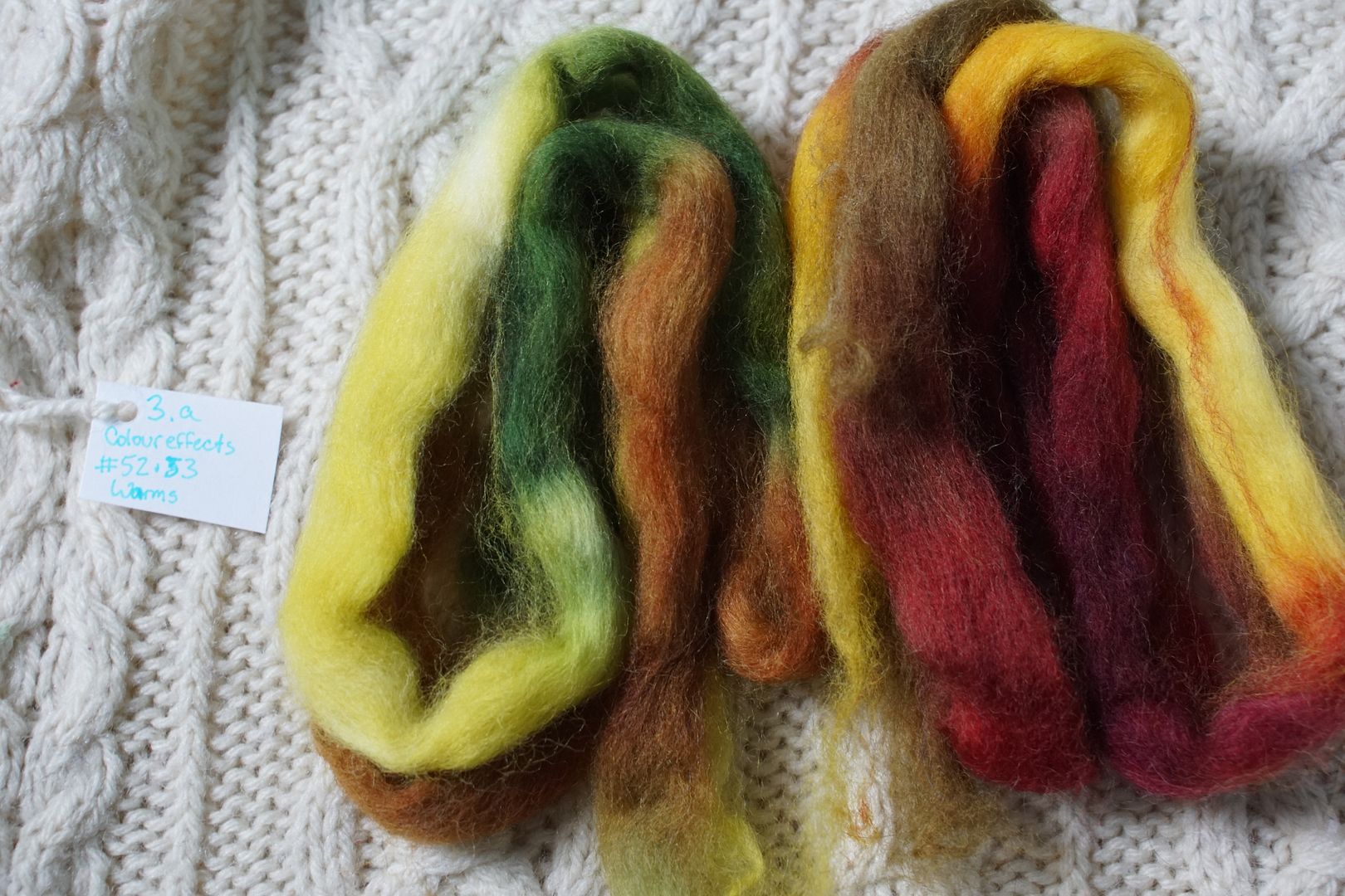
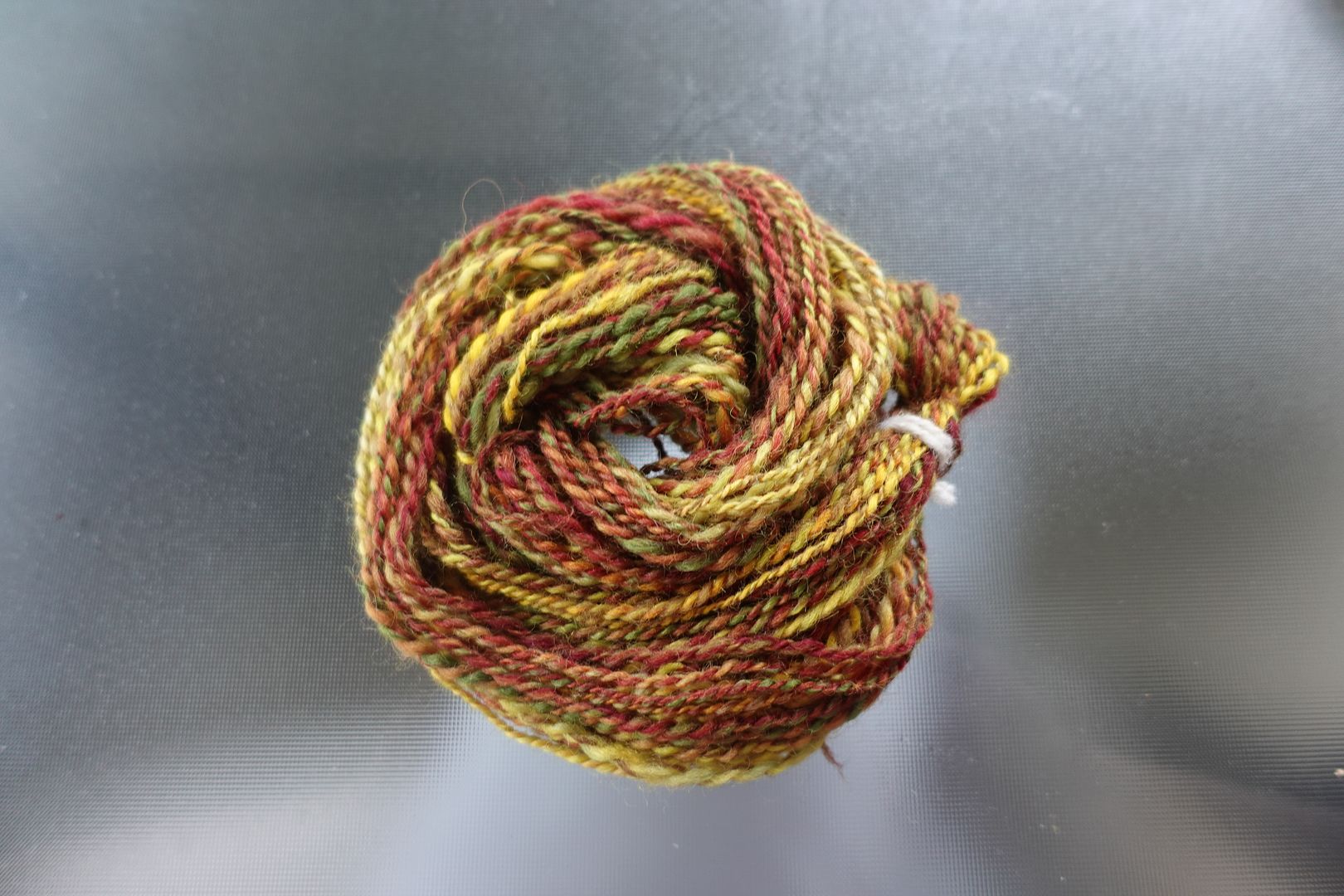
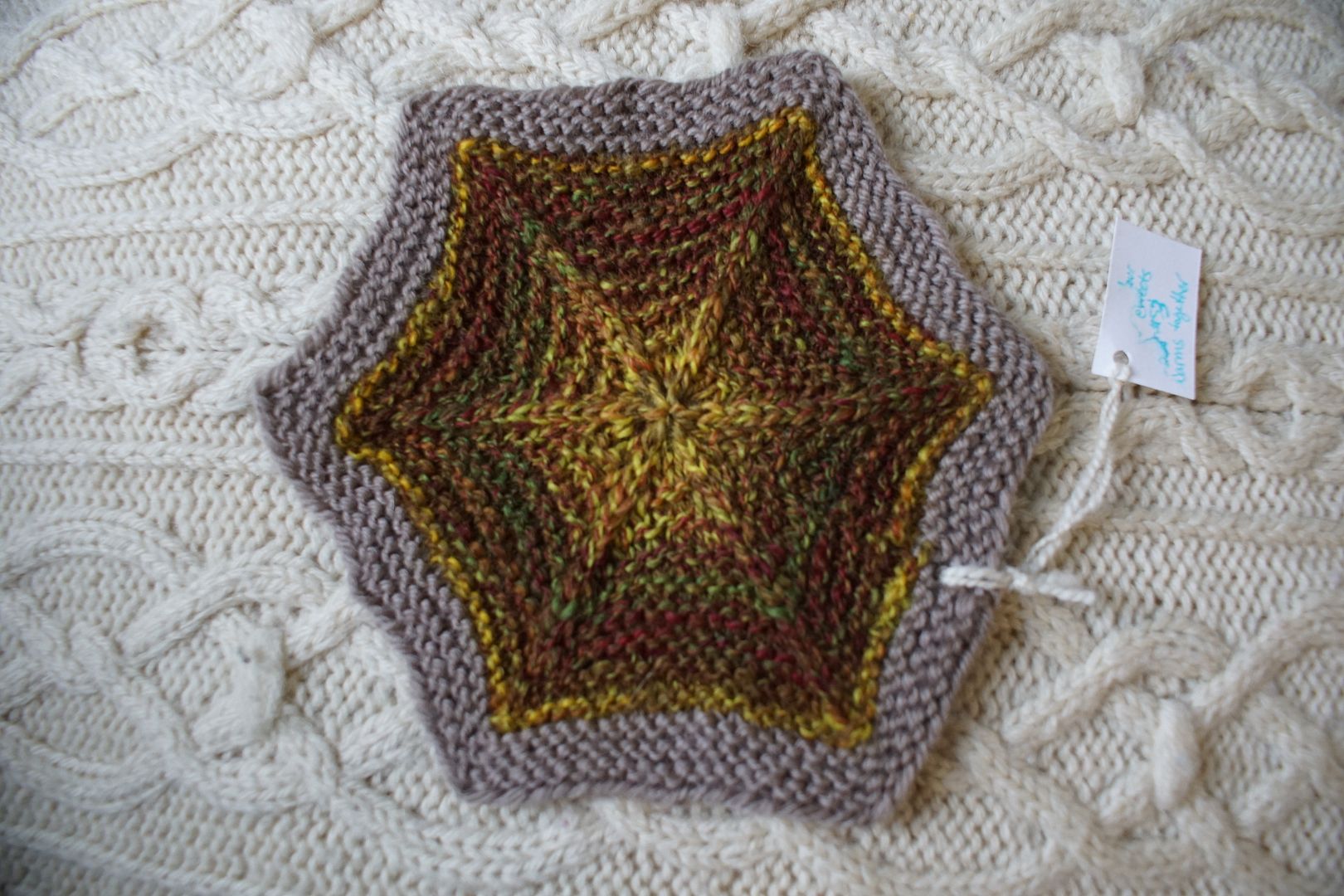
These are the two "warm" colourways I dyed at the very end of my Dyeapalooza, and I really wanted to see them together. Unfortunately the yellows came together in both spinning and plying, as did the darker values, so there's a good bit of striping. Still, warm earthy colours are my happy place!
Exercise #: 9a.a Exercise name: Complementary Strip 1: 15 - Analogous Intense Orange to Red-Violet Strip 2: 22 - Analogous Dull Blue-Green to Yellow Prep method: Dizzed through hand card Spinning tool: EEW6 Wool breed: Corriedale
Contrast of hue: High Contrast of value: Middle major Cold-Warm Contrast: More warms than cools, warmer 2/3 of the colour wheel Complementary Contrast: Present (R/G, RO/BG, RV/YG) Simultaneous Contrast: Not evident. Not really seeing shifting the way things lined up. Contrast of Saturation: Red colourway intense, Green colourway dull but not too dull Contrast of Proportion: Hard to say because singles lined up, but warms seem to have dominated; makes sense from intensity perspective
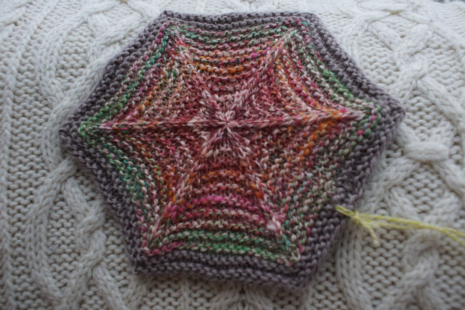
We're getting to the hexies that just happen to be in this section because it's where they went best, not because they're really red. The yarn is gorgeous, and you can't tell in the yarn how much it would stripe!
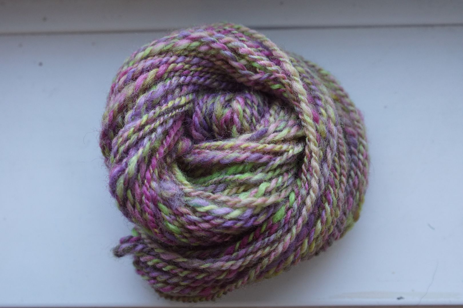
Contrast of hue: High Contrast of value: High middle major Cold-Warm Contrast: Slightly more cool purples than warm yellows and greens Complementary Contrast: Present Simultaneous Contrast: Kinda evident, some mud and some pop Contrast of Saturation: Fairly even all over, contributing to mud Contrast of Proportion: More purple than yellows/greens, overall feels more purple
This is a good example of complements desaturating each other. Sometimes they look more speckled, but since the individual colours were already on the paler side, there was more optical mixing. Out of all the combo drafts, this is the one that mixed most closely to the background "Latte" colour.
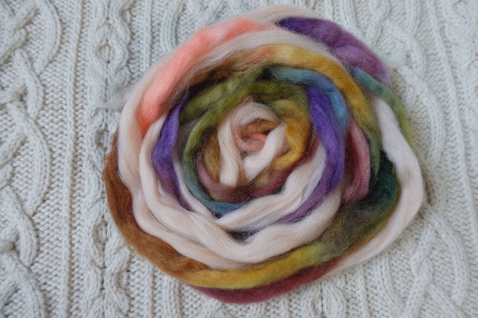
Contrast of hue: Moderate Contrast of value: High major Cold-Warm Contrast: Mix of warms and cools, but everything has a cool undertone Complementary Contrast: Present but muted Simultaneous Contrast: Possibly evident with how the pale peach and dark green interact Contrast of Saturation: Darks, pales, and dulls throughout, evenly desaturated Contrast of Proportion: Pale peach dominates, supported by tans, purples, and reds which recede; green surprisingly aggressive for small amount
This is in my top ten favourite hexies, and I couldn't even tell you why. It's got a surprise and a pizzazz to it, despite being so desaturated and earthy. Is it that concept of simultaneous contrast that sets the peach and green off from each other so nicely? Dear me, I love this.
Contrast of hue: High Contrast of value: High middle major Cold-Warm Contrast: Mostly warm, though cool undertone present almost everywhere Complementary Contrast: Present Simultaneous Contrast: Colours lined up so it's hard to say, possibly in the way the little bit of pink pops and blue-green shifts more green Contrast of Saturation: Handpaints quite saturated, compared to pale solid. Would have been quite different had the reds and greens mixed more. Contrast of Proportion: Saturated colours 2/3 proportion, they are desaturated by the pale peach throughout. Again would have been quite different had the reds and greens mixed more.
These complements intensify each other rather than desaturating, despite the peach making everything lighter.
I think a theme running through this red corner is that I like almost anything when it's more blended, and I dislike almost everything when it stripes. But then, when you zoom out and see all the hexies together, the sheer variety and movement makes everything seem wonderful, but who knows?


No comments:
Post a Comment