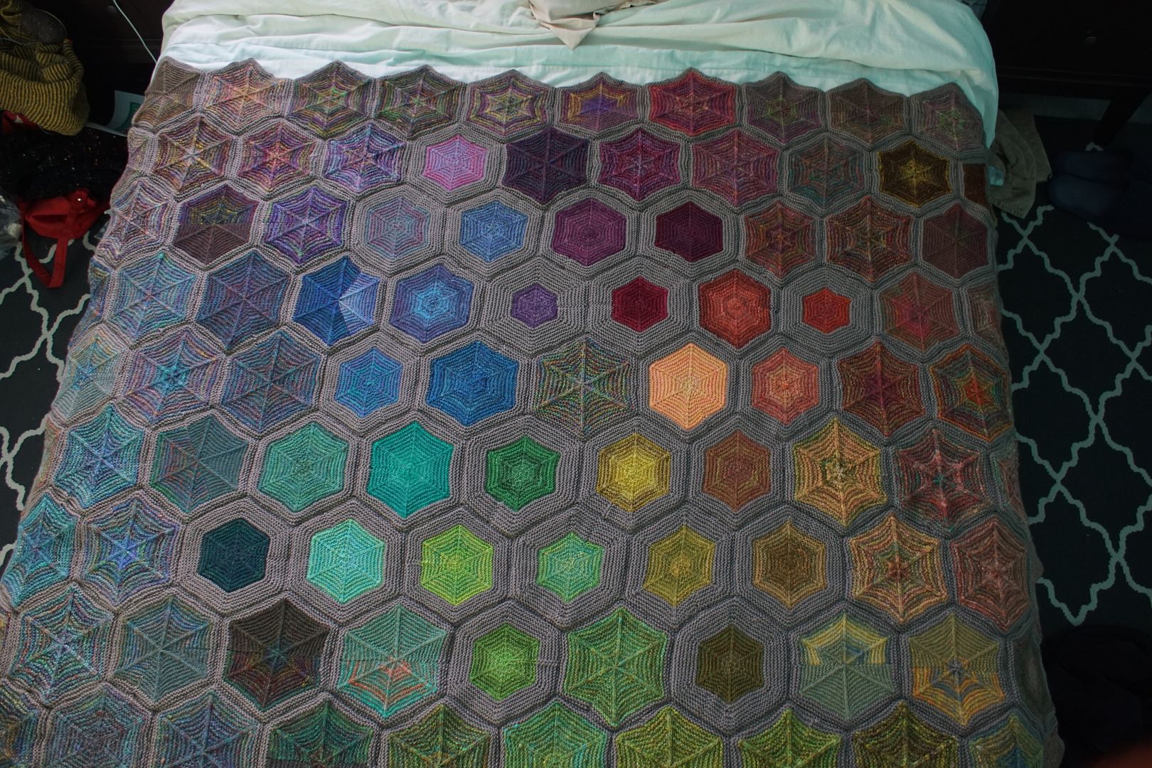
After months of planning, dyeing, spinning, knitting, cataloguing, vlogging, with a finishing touch of lots of sewing, my Year of Colour project is done. 110 hexagons: 51 from samples spun from single colourways, and 59 from combo drafts of different c…
After months of planning, dyeing, spinning, knitting, cataloguing, vlogging, with a finishing touch of lots of sewing, my Year of Colour project is done. 110 hexagons: 51 from samples spun from single colourways, and 59 from combo drafts of different colourways.
By my somewhat rough calculation, I spun 1,881 yards of DK-weight combo drafted yarn. I didn't measure the single-sample yarn, but I'd put that around 1,000 yards of heavy fingering weight. I also used 18 skeins of the main colour, Patons Classic Wool DK superwash in the colour "Latte", about 2,200 yards.
That's... a lot. I didn't mean to make such a big thing when I started, though I did hope it would be more than a lap blanket! The hexies accumulated, one at a time, with a certain amount of discipline, over the course of more than six months.
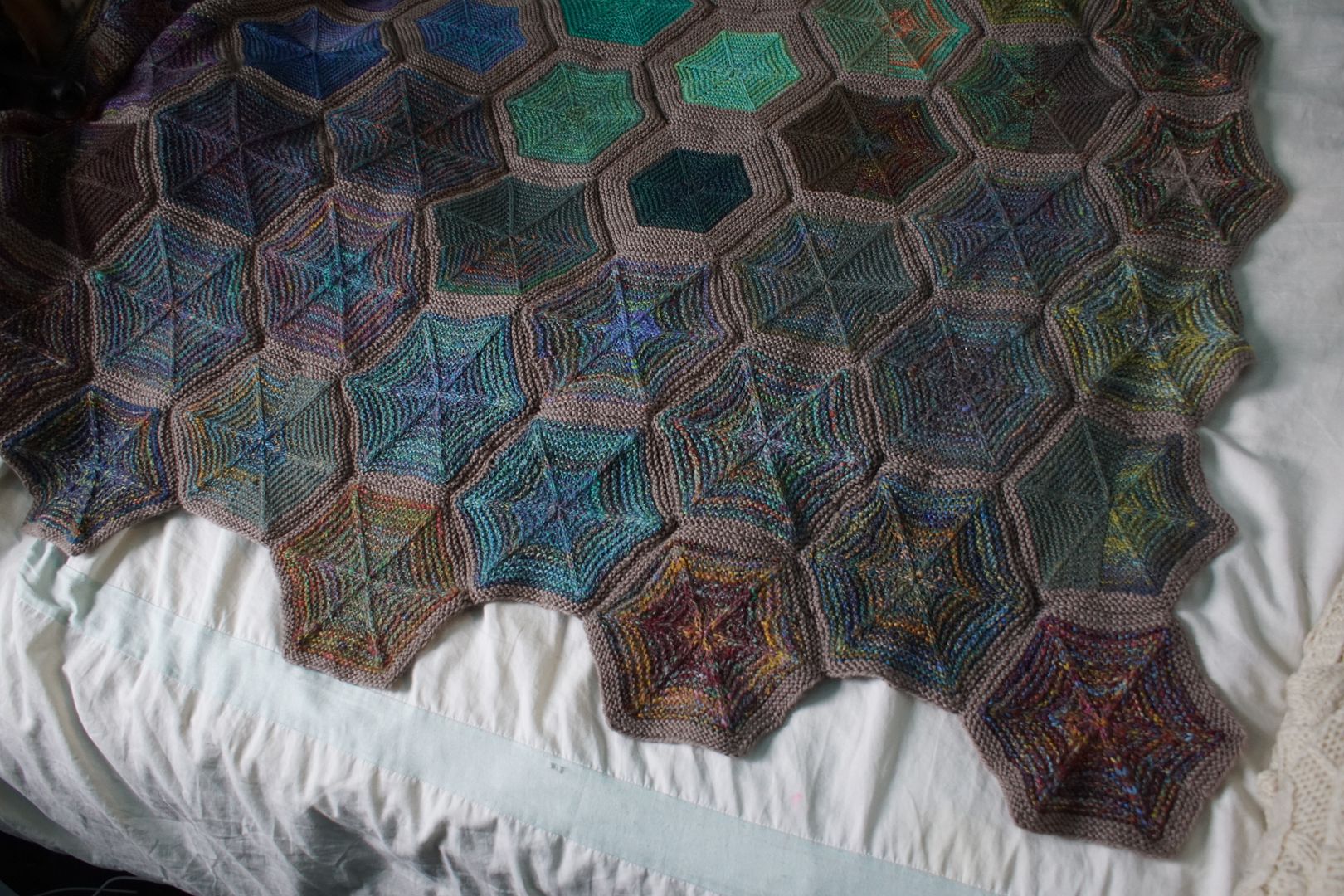
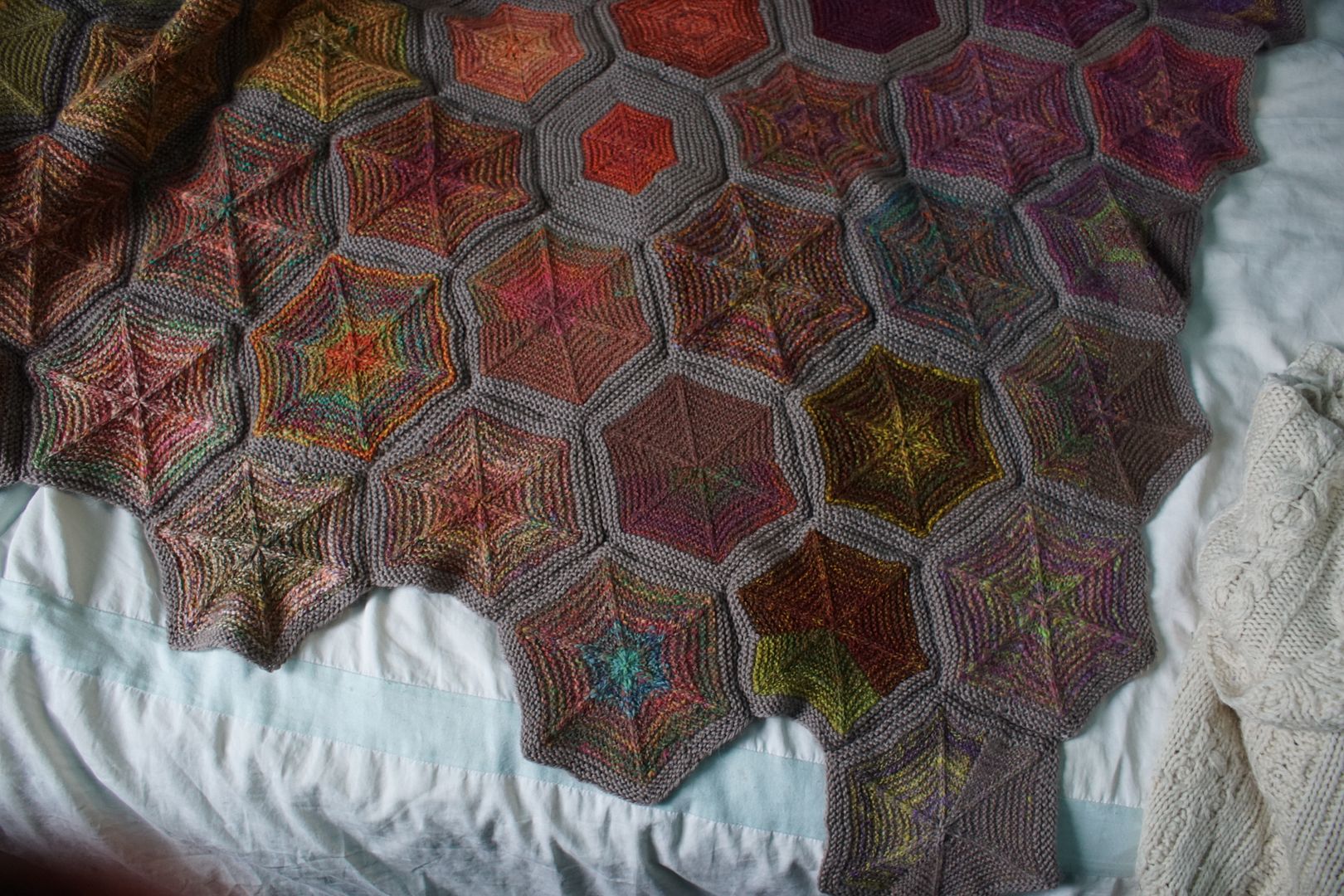
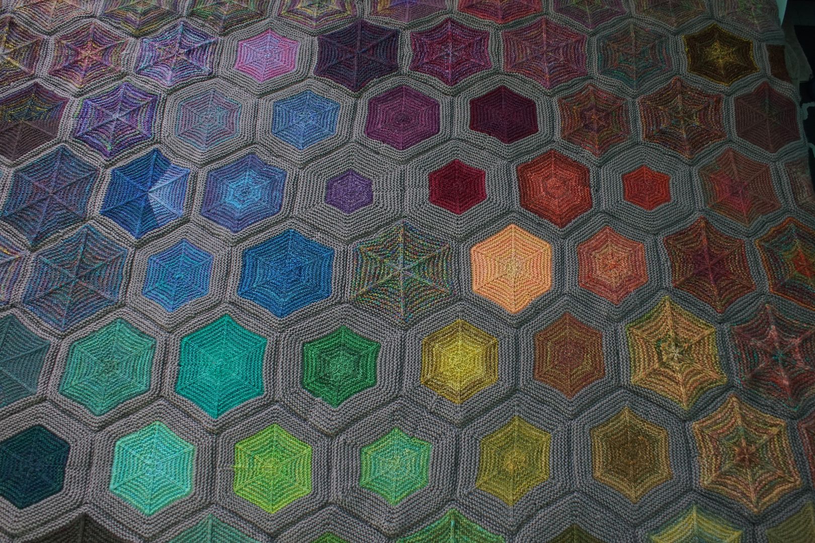
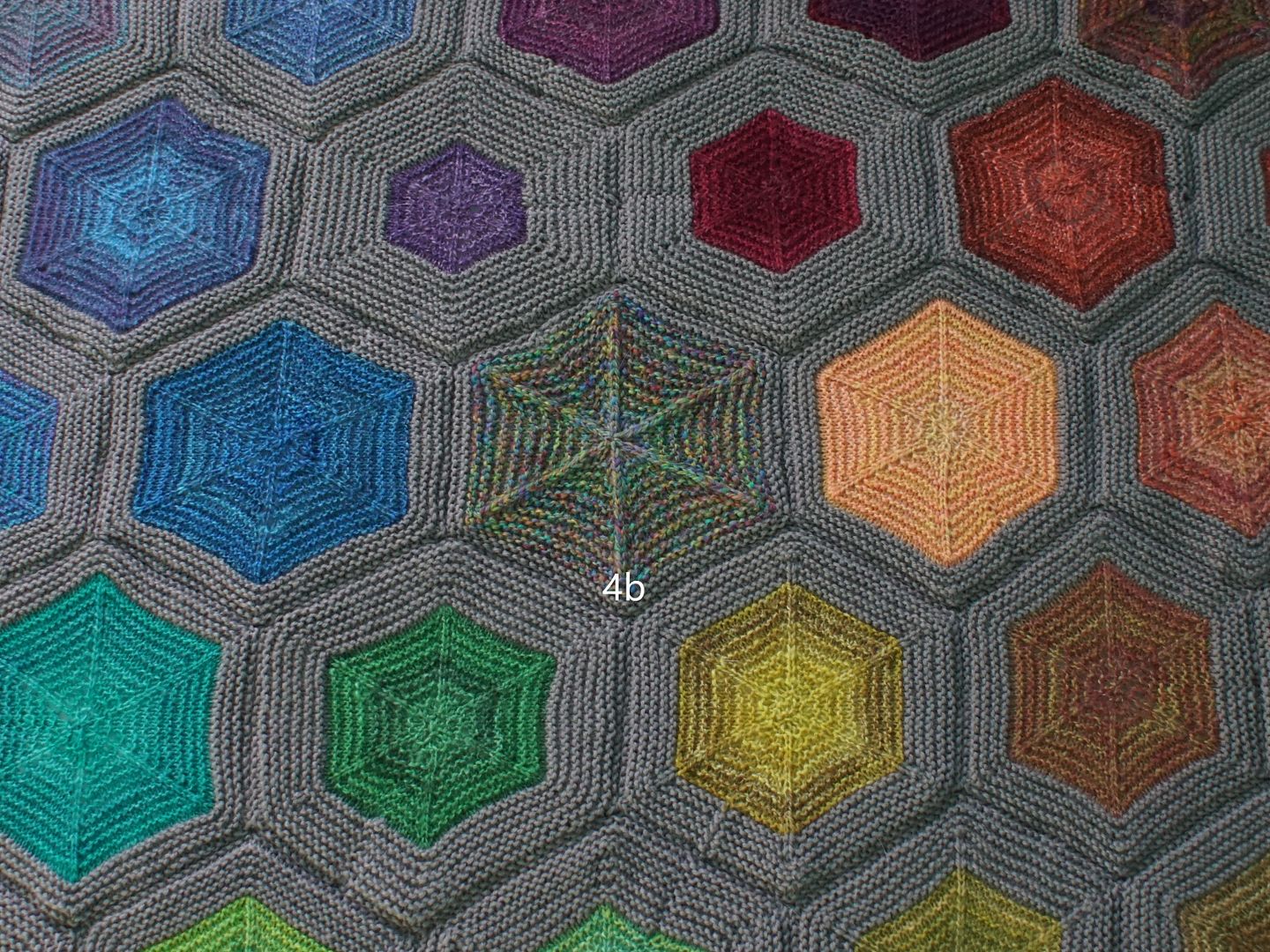
Anyway, I'm not primarily here to toot my own horn; I'm here to talk about what I did. When it came time to arrange them, I tried a couple different ideas, but landed on this. I put the most saturated colours in the center, gathered around the most balanced, rainbow-like combo draft. I placed other colours around them, grouping by hue as best as I could, ordering by saturation. So the both the most wildly mixed up and the most washed-out are on the outer edges, and the combo drafts of similar hues are conveniently adjacent for comparison.
I've been promising myself for months that when I was finished, I would do a blog post for each combo drafted colourway. That's 49 colourways; some had enough yarn for two hexies. When I sat down to start, though, (a) 49 posts is a LOT, and (b) it felt like I was redoing the work I had already done on the Wool Circle. Since August, I've been sharing month by month about each experiment as I finished the hexies. I wanted to share about them, but not all tidy like that again.
But after I finished putting the blanket together, I had another idea. I could do a smaller number of posts, reviewing different areas of the blanket. This would allow me to do something I hadn't really been able to do on the podcast: compare different blends of similar hues.
When I look at the blanket, I see five areas. Roughly, they are red, yellow-orange, green, blue, and pink-purple. So I have five posts planned out, to explore each of the hexies in the company of its neighbors.
As Rachel was teaching her way through the Year of Colour in the Spinning Purls videos, she spent the bulk of her teaching time exploring the seven colour contrasts described in chapter 1 of Color in Spinning by Deb Menz. I'm going to analyze each hexie from that perspective.
Contrasts 1. Contrast of hue: When we think about "colour," we're usually thinking about hue. Is it red, orange, yellow, etc.? Looking at the fiber used, how much of the colour wheel is represented in the colourways I'm bringing together? If there are complementary colours present, I usually designate the hue contrast as "High", or in a few cases of high saturation, "Extreme." If the colours are analogous only, I called it "Low." And "Moderate" for somewhere in between. 2. Contrast of value: Value is whether a colour is light or dark, most evident when you take a photo of something and put it in greyscale. Here I am using the concept of value "keys" from Color in Spinning. Menz describes "major" keys as colourways that include high, middle, and low values all mixed together, and "minor" keys as just having high and middle, middle and low, or one overall value. She uses the words High, Middle, and Low to describe what the dominant overall value of the colourway is - high value being light, and low value being dark. So for example, a "high major" key would be dominated by light values, but have speckles of middle and low values present. a "low minor" key would be dark, perhaps with some mid values in there. I will look at the knitted fabric to categorize this. 3. Cold-Warm Contrast: "Cold" and "Warm" is a controversial aspect of colour theory that changes based on culture, but in modern western nomenclature, the blue side of the colour wheel is "cool," and the orange side of the colour wheel is "warm." Colours can also have undertones - there are cool oranges and warm blues. One of my biggest learnings from this year is that this is simply a subjective description, and I don't have to overthink it. Looking at the fiber, I will note what warms and cools are present, guess at undertones, and note proportions. 4. Complementary Contrast: Complementary colours live on opposite sides of the colour wheel from each other. I will simply note, looking at the fiber, whether complementary colours are present or not present. A bit redundant after hue contrast. 5. Simultaneous Contrast: This is a weird one. Simultaneous contrast is this theory that our eyes want to see complementary complements, so when colours are *nearly* complementary, they will appear to shift in a complementary direction, and pop more. Looking at the finished fabric, I will hazard a guess as to whether simultaneous contrast is evident or not evident, and how. 6. Contrast of Saturation: Saturation is about the depth of colour. A pure hue is most saturated, and you can desaturate a number of ways - by adding white, black, or grey, by simply using less dye, or by mixing hues distant from each other on the colour wheel. Looking at the fiber, I will describe how saturated different colours appear to be. 7. Contrast of Proportion: Contrast of proportion takes all these ideas and asks, what is there more of? Is there more light or dark value, saturated or desaturated fiber, more red than green, etc.? All these factors go into what the final product looks like. I use this space to draw some conclusions, noting what different proportions of things led to the final outcome. What dominates? What is a secondary characteristic that comes through strongly in a "pop" of colour? What doesn't yell at you, but adds depth and complexity to the fabric? I might also say a thing or two about Goethe, who had this theory that in order to be balanced, Yellow, Red, and Blue had to be in a 9:6:4 proportion. I was entranced by this idea at one point, but now I mostly think it's an oversimplification.
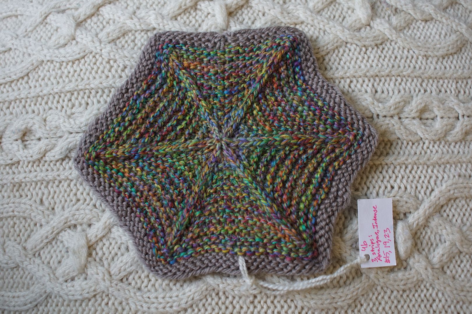
Here's what that looks like on my central hexie.
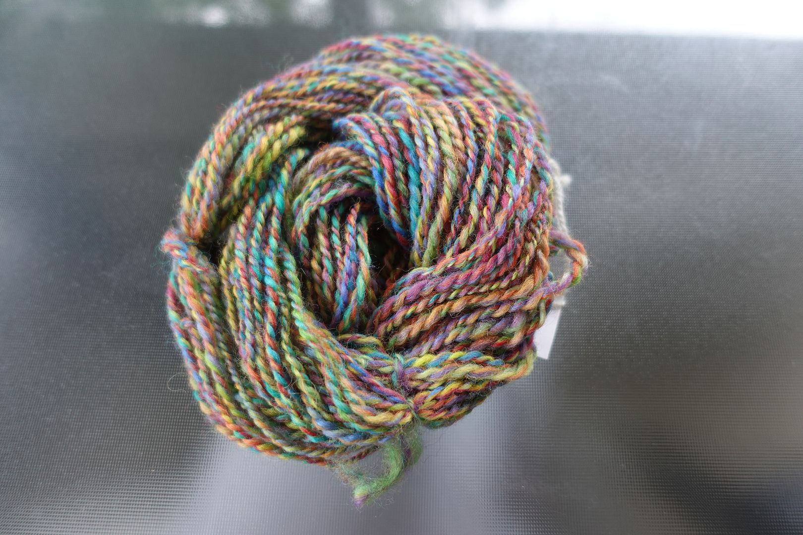
Exercise #: 4.b (this is my numbering system; I'll explain it at some point but for now it's just essential to me correlating information to write these posts.) Exercise name: Any 3 strips (from the book) Strip 1: 15 - Analogous Intense Orange to Red-Violet Strip 2: 19 - Analogous Intense Violet to Blue-Green Strip 3: 23 - Analogous Intense Green to Yellow-Orange Prep method: Narrow strips held together Spinning tool: EEW6 Wool breed: Corriedale
Contrast of hue: Extreme Contrast of value: Middle major Cold-Warm Contrast: Even around the colour wheel Complementary Contrast: Quite present Simultaneous Contrast: Probably irrelevant in such an even mix, though it may help the way the colours intensify each other instead of blending. Contrast of Saturation: Very even Contrast of Proportion: In this rare case, everything is quite even around the colour wheel. The final product appears slightly weighted toward green
Many of my colourways appear weighted toward green. I wonder if this is because of some inherent strength in green, or in the greens I used, or simply evident of my predilection toward green as a dyer?
You can expect to see 6-10 entries like this in each of the next five blog posts.
Recently, I read the introduction to Kate Davies' newest book, Colour at Work, which she posted on her blog. Having spent a whole year looking at colour theory, it was a little shocking to read her saying, colour theories are perhaps more problematic than they are helpful. But at the same time, I think this is what Katrina was trying to tell me way back in January: colour doesn't follow rules. It isn't something you can completely understand or control. As I've explored these combo drafts, I've certainly found that to be true. My ability to predict what colour combinations would look like never materialized.
However, my ability to see and describe them has grown. That is what I am trying to do now - not to capture and control colour, but to see, describe, and enjoy it. So, with a chastened idea of all these categories, I'm going to use them as much as they seem helpful to me. Sometimes I throw them out, or make some guesses, who cares. I'm just looking for insights. Enjoy!


No comments:
Post a Comment